An accessible world of work: making change in the workplace
Accessibility is a topic that we discuss regularly at Sage. In our own words, ‘Sage is committed to making products, services, and content accessible’. In doing so, we serve a wider audience and provide a better overall user experience. It’s an outlook we share with countless other businesses, big and small. But how do things […]

Accessibility is a topic that we discuss regularly at Sage. In our own words, ‘Sage is committed to making products, services, and content accessible’. In doing so, we serve a wider audience and provide a better overall user experience.
It’s an outlook we share with countless other businesses, big and small. But how do things look inside these businesses? Are we and our peers practicing what we preach?
In a mini-series of articles, we will explore ways to make workplaces more inclusive and provide a better overall colleague experience. These are steps we have actively taken at Sage to ensure we are making it a better place to work for those with an access need, and this helps create a better place to work for all.
Read on and join our pledge to make workplace accessibility considerations the norm for all businesses. Find out what you can do to make a difference.
Making Outlook accessible
Outlook is one of the most used tools for businesses, so where better to start? Here are a few tips on the promotion of accessible emails, and recommended tools to make our files easy for all to use.
Check, then send: Accessibility Checker for Outlook emails.
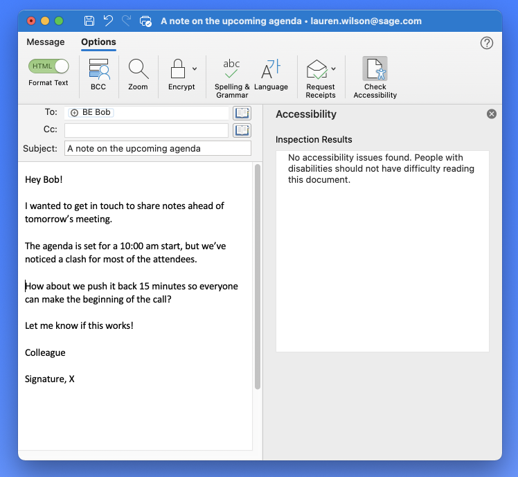
- In Outlook, while writing or replying to an email message, select Options and click Check Accessibility.
- Review your results. You’ll see a list of errors, warnings, and tips with how-to-fix recommendations for each. You can review the Rules for the Accessibility Checker for more information.
- Select a specific issue to see why you should fix the issue and what steps you will need take to change the content.

The accessibility checker will review a number of criteria, which can include elements such as alternative text with visuals, meaningful anchor text on hyperlinks, contrast for text and background colours, larger font sizes, and more. Our accessibility checklist outlines some of these accessibility requirements.
Tip: To help you to remember to run the Check Accessibility tool, I’d suggest changing your Outlook ribbon to include a new tab with only the Check Accessibility button visible.
Accessible emails
Another useful tip is to state that you prefer accessible content in the emails you receive. This can help to promote the use of accessibility features and makes colleagues more aware of the importance of accessibility. To do this:
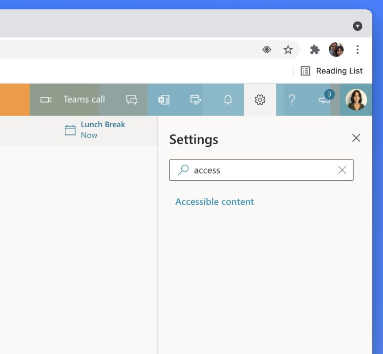
1. Enter the Settings area of your web-based Outlook email. It will appear as a cog icon at the top right of the screen.
2. Search the word ‘access’ in the search box and then select Accessible Content.
3. Tick the box next to Ask senders and this will enable you to send content that is accessible.

When a colleague who is using Outlook 365 writes you an email, they will now see an on-screen warning if they used any inaccessible content. Helpfully for the sender, selecting Review Accessibility Issues option opens Outlook’s Accessibility Inspector feature to advise how to resolve any issues that it might flag.
Spreading the word of accessibility at work
Accessibility is not just about taking technical steps for improvement in the workplace. It’s also about awareness and communication.
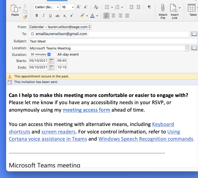
Try adding a phrase like ‘This email has been checked for accessibility’ within email signatures, to help put it at the forefront of colleagues’ minds.
The Accessibility Checker also runs across the Office suite, so you can keep an eye on accessibility while you work in Word, Excel, and PowerPoint. The set-up is the same as Outlook in that you can add the ribbon or be notified of accessibility issues in your documents as you work on them. To enable this feature, select the checkbox for ‘Keep accessibility checker running while I work’.

Clearer communication is crucial
How we communicate at work should also be considered when it comes to inclusivity. If we’re chatting using tools like Slack and Teams, we tend be a little more casual in tone, including our phrasing and language used. While these kinds of tools are valuable for collaboration and connection, we also need to make sure that they’re inclusive, too. Here are a few things to consider when using chat services, apps, or tools…
Labelling your images and attachments
The saying goes that a picture paints a thousand words. However, if the words are ‘screenshot-01-05-2021’, this can make it much more difficult for all users to understand what that image is. Similarly uploading an image saved with ‘screenshot’ as its image name is not very descriptive.
Here’s a quick way to add some context for users of assistive technology so that when you share or send images, they can interpret what the content of that image is:
1. Upload the file and click on the image to expand it – a new window will open.
2. In the top-left corner of the window, select Edit.
3. Rename the file with a description of the image. There is no need to add alt text, as screen readers will announce that it is an image, but the description should be simple and accurate.
Currently we are using the work around of adding descriptive text when posting an image.
Good practice for GIFs
Much like images, GIFs are frequent in our day-to-day chat to convey everything from humour to feelings and reactions. Sometimes, a Chandler Bing clip says more than you could ever type!
Like Emojis, GIFs can serve as powerful language enhancers. However, to make sure that everyone using assistive technology is in on the fun, it’s best to add captions to your GIFs to provide context.
Here’s how you can add captions for best practice using tools like Slack:
1. Type /giphy #caption ‘write description here’ [this is your giphy search term] in the message compose field.
2. You may need to select Shuffle until you find the GIF that you’re looking for. When ready, select Send. Your new caption will also be overlaid on the GIF itself.
Making links make sense
Replacing a long complex URL with linked anchor text is a great way to save space in a post, but it also has other useful functions for accessibility. Hyperlinks using anchor text can tell the user what the purpose of the link is, where the link is going to take them, or what will happen when the link is clicked.
This is incredibly helpful for users who tend to skim content or are looking for specific information but it’s also great for users who rely exclusively on keyboard navigation. Keyboard navigation only enables users to click on links that receive focus. Therefore, it is good practise to ensure that links have clearly understandable anchor text when designing applications, webpages, and within all other content.
So instead of ‘click here’ or unrelated phrasing, create anchor text that is more explicit. For example: ‘visit our bank of resources’ or ‘click here to open document in a new window’,
Here’s some quick steps on how to do this when inserting hyperlinks into copy or creating links on page:
1. Use descriptive text that explains what the link is directing to, or what action you’d like the user to take
2. Aim to include an action within the link
3. Don’t be afraid to user longer, more descriptive anchor text where appropriate – especially if it will help make the more sense to do so
4. If a link opens a new tab or window, mention this in the link text to make it clear to the user what will happen when clicked.
5. Use text that relates closely to the topic or heading on the destination page
Learn more about navigating web pages using a keyboard and how you can create content that is more inclusive for users who rely on this technology.
Be mindful with Emojis
You may have been using Emojis to help break up content in a post or using them to create headlines or dividers in Slack or Teams. This might look great for users using a regular screen view, but for those using assistive technology, this can impact accessibility. When you include an Emoji, the screen reader reads out the description of that Emoji, like it would with an actual image within the content. If you have multiple Emojis in a row, the screen reader will read this out in full. For example: black circle, small black circle, laughing face. This can be incredibly frustrating and confusing for a user.
Assistive technology will read Emoji names one by one, which defeats the point of the Emoji’s purpose – to enhance meaning, and to do so quickly and effectively. Instead, it detracts from the actual substance and meaning of the content.
Instead, consider using simple text formatting instead to help you craft attention-grabbing posts.
Additional ways to remove communication barriers
A colleague might have difficulty reading or writing messages in software like Teams for many different reasons. Maybe the content is not in their first language. Perhaps they have learning difficulties. Or maybe they have excellent hearing but impaired vision.
Microsoft Team’s Immersive Reader feature can help manipulate text to fit a user’s needs, whatever the challenge may be. From breaking words down into syllables or helping users with dyslexia to visualise the words.
Nouns, verbs, adjectives, and adverbs within text can be highlighted in different colours to help give a visual learning experience. And for those who experience colour sensitivity, such as colour blindness, users can even manipulate the colours and brightness.
Hear posts and messages read aloud using Immersive Reader in Microsoft Teams by selecting the triple dots and then ‘Immersive Reader’.
Tip: If it’s just translation you need, there’s also a shortcut from each message that will translate any content if it’s not in your current language. Just hit the triple dots, then translate.
Easy, right?
These are just a few of the simple steps we can take towards creating a more accessible world of work for colleagues and co-workers of all abilities.
As part of this ongoing series, we will also look at tips we use at Sage to make meetings more inclusive and share ways to make the most of your colleague’s capabilities during calls.
You can also find out more about our pledge towards accessibility through our Sage accessibility hub and discover the steps we are taking to make our culture, products, and website more inclusive.


